>> Continued From the Previous Page <<
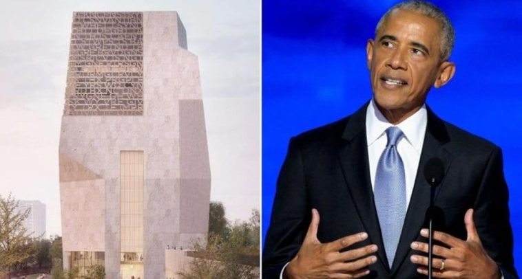
Others were far less charitable. “The words are cut off. The Ts, Ls, and Is are indistinguishable,” wrote former investment banker and bestselling author John LeFevre on X, adding that the structure “Looks like a trash can.”
Academic voices echoed the same concern. Jacob Shell, a professor at Temple University, said the typography itself was fundamentally flawed. He noted that the E’s are “indistinguishable from F’s,” adding that “multiple words get disjointed — not just on one plane but two.”

“Truly, one of the most headache-inducing reading experiences I’ve ever had,” Shell said after attempting to decipher the inscription.
Conservative commentators wasted no time piling on. “They somehow managed to make the Obama presidential library even uglier,” conservative influencer Johnny Maga wrote bluntly. “My gosh.”
Unsurprisingly, the internet took notice. Memes mocking the building’s appearance spread rapidly, using fake inscriptions to highlight what critics see as the project’s tone-deaf design. One meme reads, “We have been trying to reach you about your car warranty.” Another sarcastically resurrects one of Obama’s most infamous healthcare promises: “If you like your plan, keep your plan. If you like your doctor, you can keep your doctor.”

Beyond aesthetics, local residents have voiced ongoing concerns about the center’s massive footprint, its stark architectural style, and the potential strain it could place on traffic and neighborhood infrastructure. Some community members say the design feels disconnected from the character of Chicago’s South Shore, arguing that it offers little in the way of inviting green space or practical amenities.
The project has been controversial from the start, weathering years of debate over land use, public resources, and economic impact. After repeated delays, the center is now scheduled to open in June.
Foundation officials continue to insist the site will ultimately benefit the city. They argue it will drive tourism, create jobs, and provide educational programming, stressing that construction remains ongoing and that refinements are still possible as the project nears completion.
Still, the building’s imposing look has earned it unflattering nicknames, including comparisons to the “Death Star” and descriptions like a “concrete tomb.” Addressing that criticism, a foundation official told the New York Post that the design was never meant to appear ominous.
“The shape of the building was actually meant to mimic four hands coming together to show the importance of our collective action,” Obama Foundation deputy director Kim Patterson told CBS Chicago.
Patterson also defended the tower’s limited number of windows, noting that the decision was deliberate. “There are not a lot of windows on the building, but that’s intentional because sunlight is just not a friend to the artwork and the artifacts that are going inside of the building,” she said.
Meanwhile, Valerie Jarrett, the foundation’s CEO and a longtime Obama confidante, emphasized that the former president himself has been deeply involved in shaping the project.
“I wish that people could be a fly on the wall to see how many times in the course of the day that I hear from President Obama about ideas for the center, tweaks, programming, what we can do for the design,” Jarrett said.
Whether that hands-on involvement will ultimately quiet critics remains to be seen. For now, the Obama Presidential Center stands as a lightning rod—drawing attention, controversy, and ridicule long before its doors even open.

